
Order Block Footprint Read: Inside the Bars of a Demand Zone That Held Every Retest
A demand order block was tested three times. Four bars traded beneath it, two more pressed into its bottom rows, and not one of them closed below it. On a candle chart that is a story about wicks. On the footprint it becomes a story about who traded where — selling that printed beneath the zone and found no follow-through, and the stacked imbalances that marked each turn. This read walks the whole chart, then opens the decisive bars cell by cell.
SMC ChartSense Team · 14 min read
What this article reads: One demand order block across its full visible life, in ten phases and two footprint views: the zone forming at the base of a recovery; price leaving it with force; a first retest made of four probes into and beneath the zone, every one closing back inside; the bar that turned that retest, printing stacked ask-side imbalances in the zone’s own rows; a shallow, quiet second revisit; a third retest with two more probes and a bid-side press that held above the zone’s lower boundary; the turning bar of that retest; and the later pullbacks that never reached the zone again. The chart is a historical chart from our library; instrument, dates and price levels are withheld so the reading stays on behaviour. Zone markings and structure labels shown are descriptive detections of historical structure, not recommendations or trade prompts.
Some links to TradingView are affiliate links — we may earn a commission if you subscribe through them, at no extra cost to you.
Every order block read in this library has made the same argument from the outside of the candle: a wick through a zone asks a question, and the close answers it. That rule holds as far as it goes, but it is a rule about the result. It says nothing about what the bar was made of — whether the wick beneath the zone was a handful of trades or a wave of aggressive selling, whether the bar that turned price away from the zone was a few eager participants or a sustained lift through level after level.
The footprint answers exactly those questions. It opens each candle into rows of price and splits every row into what traded at the bid and what traded at the ask. Put a footprint on a zone’s retest bars and the familiar wick-and-close reading gains a second layer: you can see where the aggression printed, how much of it there was, and whether price went where that aggression pushed.
This chart was chosen because the zone was tested hard, more than once, and held each time — which makes the inside of its retest bars unusually instructive. Nothing here concerns what the zone would do next, and nothing on the chart could tell you. What follows is a record of what it did, read twice: once in candles, once in cells.
Phases 1–5 — Formation, launch, and the first retest
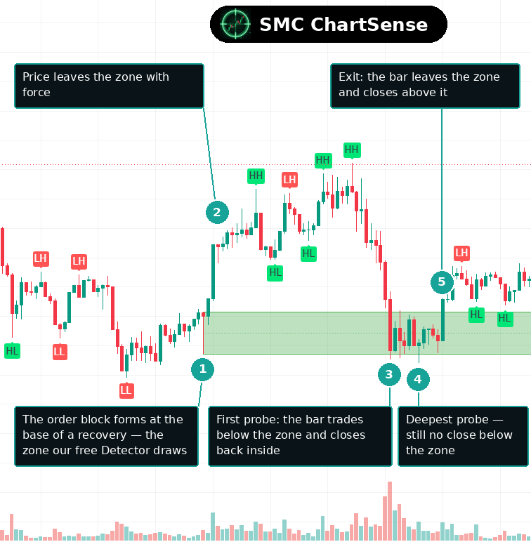
1. The order block forms at the base
The chart opens in a slow, choppy decline that bases out in a cluster of overlapping bars. From that base a recovery begins, and the Order Block Detector marks the green demand zone at its origin — a band drawn from the bar where the recovery started. The Detector draws a zone only when a fair value gap forms at that anchor, so the band is marking a place where price left with enough speed to skip ground.
At this point the zone is a hypothesis with one fact behind it: a recovery began here. Everything that makes it worth studying happens later, when price returns. A zone that is never revisited teaches nothing; this one was revisited three times, and the revisits are the read.
2. Price leaves the zone with force
The bar after the anchor drives up and away from the band on strongly positive delta — aggressive buyers lifting offers through the move, not price drifting up on thin trade. The structure overlay stamps a run of higher highs and higher lows above the zone as the recovery extends.
The departure matters because it is the reference for everything that follows. A zone that price leaves with force has a recorded character: this is a place where the ask side was willing to pay up. When price later returns, the useful question is whether the same character shows up again inside the retest bars — and the footprint is where that question can actually be checked.
3. The first probe — beneath the zone, and back inside
The recovery tops out and rolls over, and the decline that follows drives straight back into the band. The first bar to arrive is the heaviest bar to touch the zone anywhere on the chart — one of the largest volume bars in the entire window — and it does not stop at the zone. It trades through the lower boundary, prints several rows beneath it, and then recovers to close back inside the band.
On a candle chart this is the classic sweep picture: a long wick below a level, a close back above it. The footprint, opened below, adds what the candle cannot show: the bar’s delta was deeply negative, its heaviest cells sat in the zone’s bottom rows, and the rows beneath the zone carried real selling. The aggression was not imaginary. It simply did not hold price below the zone.
4. More probes — and the deepest one
The first probe is not the last. Over the next stretch of bars, price presses into the bottom of the zone again and again: a second bar trades beneath it and closes inside; a third bottoms exactly at the zone’s lower boundary on some of the most negative delta of the retest and closes inside; and a fourth delivers the deepest probe of the zone’s whole life, trading further below the band than any bar before it.
That fourth bar is the one to remember. It went furthest below the zone, and yet its delta finished close to flat — the selling that printed beneath the zone was met by nearly equal buying across the bar — and it closed back inside. The deepest wick of the retest came with the least net aggression. Effort and result had separated, in the zone’s favour.
5. The turn — a bar leaves the zone and closes above it
The retest ends with a single bar that starts inside the zone and finishes above it. Its delta is strongly positive, and its footprint shows something the probe bars never did: a run of stacked ask-side imbalances printed in the zone’s own rows, aggressive lifting level after level with little on the other side of the diagonal.
That stack is the transaction-level picture of the departure from phase two, repeated: the zone’s recorded character showing up again inside the bar that turned price. It is a description of how that bar traded — not a promise that the next retest would end the same way, which is precisely why the chart’s later phases are worth reading.
Inside the bars — the first retest


Read columns A to D as one sequence. All four bars printed negative delta — on the summary number alone, the aggressive side was selling in every one. Three of them traded beneath the zone, and the rows below the line are not empty: they carry real bid-side volume, including rows where the bid outweighed the ask above it by more than three to one. Selling arrived, crossed the spread, and traded beneath the zone in size.
And every amber marker sits above the line. Each bar closed back inside the zone. Column D is the sharpest version of the lesson: the longest ladder beneath the zone, bid-side imbalances below the boundary, and a bar delta barely below zero with a close back in the band. Heavy selling beneath a zone that never produces a close beneath it is the footprint signature of selling being absorbed — read here, as always, in the past tense, about these four bars.
Phases 6–10 — Two more visits, and the aftermath
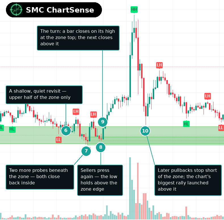
6. A shallow, quiet revisit
The second visit looks nothing like the first. Price drifts back into the zone’s upper half on some of the lowest-volume bars of the whole chart, never reaches its lower half, and drifts out again. There is no probe, no deep wick, and very little aggression in either direction.
Quiet revisits are easy to skip, and they carry information anyway. A zone that price touches without urgency, and leaves without a fight, is a zone whose upper boundary is still being respected even in a market with no energy. The heavy tests bracket the zone’s life; the quiet ones fill it in.
7. Two more probes beneath the zone
The third retest is a return to the bottom. Price slides through the zone and two consecutive bars trade beneath its lower boundary — the first probes since the first retest — and both close back inside. The probes are shallower than the deepest one from phase four, and the volume behind them is lighter.
By now the zone’s record has a shape: every bar that traded beneath it, across two separate retests, closed back inside it. None of those closes is a guarantee of the next one. Together they are a consistent description of how this zone was treated whenever price reached its lower boundary.
8. The press — sellers lean on the zone’s bottom rows
Then the most interesting bar of the third retest: a press into the zone’s lower section on clearly negative delta, with a run of stacked bid-side imbalances in its footprint — aggressive selling hitting bids level after level, the mirror of the stacks that marked the turns. If any bar on the chart looked like the zone giving way, it is this one.
Its low held above the zone’s lower boundary, and it closed inside. A stack of bid-side imbalances is a record of aggression pressing; it says nothing on its own about whether the pressing worked. The footprint below puts this bar beside the two turns, and the comparison is the clearest single picture of the chart’s argument.
9. The turn of the third retest
The very next bar reverses the press. Its delta flips positive, its footprint prints stacked ask-side imbalances in the same rows the press had just hit, and it closes on its high near the top of the zone. The bar after it closes above the band, and the third retest is over.
The symmetry with phase five is the point. Both retests ended with a bar whose ask side lifted through the zone’s rows in a stack. The footprint did not announce either turn in advance — both stacks were visible only in bars that had already printed — but it recorded the same kind of turn twice, at the same zone.
10. The aftermath — a zone never reached again
Some hours later, the chart produces its largest bar of the whole window: a violent rally launched from above the zone on the heaviest positive delta in the data, spiking to the chart’s highs before reversing sharply. The pullbacks that follow stop short of the zone, and every later approach in the visible history stays above its upper boundary.
From formation to the end of the visible history, not one bar closed below the zone’s lower boundary — through four probes in the first retest, a quiet revisit, two more probes and a stacked press in the third. That is the zone’s observed record, complete for this window. What it did beyond the window is outside this chart, and outside this article.
Inside the bars — the press and the turns


Column F is the press: a block of red cells in the zone’s lower rows, aggressive selling stacked across consecutive levels, and a close still inside the band. The columns either side are its opposites. E, the first retest’s turn, shows a long green stack in the same region of the zone, and G, the third retest’s turn — the bar immediately after the press — shows another, over the very rows the press had just struck.
Notice what the figure does and does not show. It shows that both kinds of aggression printed inside this zone, in stacks, and that the bars carrying ask-side stacks were the ones that turned price. It does not show any way to know, while the press was printing, which stack would come next. That ordering only exists after the fact — which is exactly how a footprint should be read.
What this scenario teaches that most SMC content misses
A sweep has an inside, and it can be measured. SMC content describes wicks beneath zones as liquidity sweeps and stops there, because a candle can show nothing more. The footprint shows the wick’s contents: real bid-side volume printing beneath the zone, sometimes in imbalance, and a close back inside regardless. That converts “it was a sweep” from a label applied after the close into a description of what traded — selling that crossed the spread below the zone in size and failed to hold price there.
Delta without location misleads. Every probe bar in the first retest printed negative delta. Read as a number, that is four bars of sellers winning. Read against the zone and the close, it is four bars of selling that did not move price where it pushed — and the bar that probed deepest carried the least net selling of all. Delta records effort. Where the bar closed, relative to the zone and to the heavy cells, records result, and only the two together describe what happened.
Stacks describe turns; they do not announce them. Both retests ended in a bar with stacked ask-side imbalances in the zone’s rows, and the third retest’s turn followed a bar with a stack in the opposite direction. Every one of those stacks was visible only in a completed bar. The habit worth building is recognising what a stack recorded once the bar closed — not treating its appearance mid-bar as a forecast, which is a different instrument from the one on the screen.
The reader’s takeaway
The structural read of this chart is the one the library has made many times: a zone tested repeatedly, wicks beneath it, closes back inside, and a level that held through every examination in the visible history. The footprint read does not replace that story. It fills in the bars — showing that the wicks were made of real selling, that the turns were made of stacked lifting, and that the deepest probe was the one where effort and result came furthest apart.
The transferable habits are two. First, read retest bars in two layers: the close for the verdict, the cells for the contents. A probe whose close returns inside the zone tells you the verdict; the footprint tells you how much aggression that verdict overcame. Second, look for the zone’s recorded character to reappear. Price left this zone on strong lifting, and both retests ended with the same kind of lifting printed in the zone’s rows. That repetition is an observation about this chart, not a property of zones.
And the coda this series always ends on, because the footprint makes it easier to forget: nothing in these cells forecast the next bar. Every reading here was made of bars that had already closed. The footprint records the transactions inside a zone’s tests with far more detail than a candle can; it does not tell you how the next test will go. Read it as a record, and it is one of the richest records a chart offers.
Reading a footprint in a figure is not the same as reading one live.
TradingView offers a Volume footprint chart type that shows how trading volume was distributed across the price levels inside each bar — the view this article opens up at the zone’s retests. Footprint charts require a Premium plan or higher. Our free Order Block Detector, which drew the zone on this chart, runs on any TradingView account, including the free plan.
Open TradingView →Affiliate link: if you later purchase a TradingView plan after signing up through it, we may earn a commission at no extra cost to you. Educational content. Not investment advice.
DISCLAIMER: This article is for educational purposes only. It explains concepts from technical analysis literature and reads a historical chart for teaching purposes. It does not constitute financial advice, trading advice, or investment recommendations. SMC ChartSense is strictly an educational software provider designed for pattern recognition practice. We do not provide brokerage services, market recommendations, or execution platforms. We are not registered as a Research Analyst. Charts shown are historical examples selected for educational illustration only; footprint figures are computed from historical trade data for the same chart. Nothing shown describes or forecasts any instrument’s current or future price.