
The Twice-Tested Demand Zone: How a Level Earns Trust Across a Full Cycle
A clean tape read of a demand zone that defends price on two separate occasions — first as the quiet origin of a bullish cycle confirmed by a CHoCH, then much later as the target of a violent capitulation drop that prints the largest volume bar on the chart and reverses on the spot. The two tests look nothing alike, but the volume signature is the same in both: a heavy spike into the zone that immediately reverses is the footprint of institutional absorption, and a zone that survives it twice is a zone you can trust.
SMC ChartSense Team · 15 min read
What this article reads: A complete twice-tested demand cycle. The chart opens with a markdown into an origin low, where a demand zone forms (the green band) on a heavy accumulation volume spike and a CHoCH confirms the bullish character shift. Price marks up through a long bullish leg, leaving the zone untested far below. Then, mid-chart, price collapses straight back to the same zone in a violent capitulation drop that prints the single largest volume bar on the chart — and the zone holds again, reversing immediately into a second leg to new highs. The teaching focus is how a demand zone earns credibility across a cycle: the first hold plus a CHoCH establishes it, and the second hold — especially a violent capitulation wick that reverses on record volume — confirms institutions are still defending it. The volume reading is the spine of the entire analysis.
Phases 1–5 — The zone forms and is confirmed

1. Markdown into the origin low
The chart opens in a downtrend. After some early choppy structure, price sells off through a sequence of lower lows into the origin low at the bottom-left. This is the move that creates the conditions for the demand zone — a sharp markdown that drives price to a level where larger buyers are willing to step in.
The markdown itself isn’t the teaching point; it’s the setup. What matters is where it ends and what happens there. A markdown that ends with sellers simply running out of momentum produces a weak, driftless low. A markdown that ends with a sharp, high-volume flush produces a low where a real transfer of inventory occurred — and that’s the kind of low that becomes a defensible demand zone. The next phase shows which kind this is.
2. Demand zone forms at the origin
The cluster of lows at the bottom of the markdown defines the demand zone — the green band marked across the chart. (Demand zone = the price band where institutional buy orders are concentrated, identified by a consolidation or sharp reversal that immediately precedes a strong upward move.) The lows here cluster tightly: an LL, then an HL forming just above it, then price refusing to push lower. That refusal is the first sign that buyers are absorbing the selling.
At this stage the zone is a candidate, not yet a confirmed level. Plenty of lows form and then get broken on the next leg down. What separates a real demand zone from a temporary pause is what the next two phases reveal: the volume behind the hold, and the structural confirmation that follows. The zone goes on the chart here, but its credibility is earned in phases 3 and 4.
3. Heavy accumulation volume — zone holds
This is where the volume panel does its first piece of real work. The low at the origin prints on a heavy volume spike — one of the larger bars in the early part of the chart. A low on heavy volume is a low where a large transfer of inventory occurred: panicked sellers exiting into institutional buyers accumulating the supply. That’s the accumulation signature, and it’s what gives the zone its first layer of credibility.
The distinction matters because volume tells you what price alone can’t. Two lows can look structurally identical — same price, same wick, same candle shape — but one prints on heavy volume and the other on light volume. The heavy-volume low is where institutions accumulated; the light-volume low is where price simply paused. Only the heavy-volume low has the institutional positioning behind it to defend the zone on a future test.
Reading this in real time, the heavy-volume hold at the origin is the first signal that this low is the real thing. It doesn’t guarantee the zone will hold forever, but it establishes that the zone has institutional buyers behind it — which is exactly what will matter when price returns much later.
4. CHoCH — bullish character shift confirmed
Price rallies off the zone and breaks structure to the upside — the CHoCH marked on the chart. (CHoCH = Change of Character: the first higher high in a previously bearish structure, signaling a shift in directional bias from down to up.) This is the structural confirmation that the demand zone produced a genuine reversal, not just a bounce.
The CHoCH is what upgrades the zone from “candidate” to “confirmed.” The sequence matters: heavy-volume hold first (phase 3), then structural confirmation (phase 4). The volume told us institutions were buying; the CHoCH confirms that their buying was enough to flip the structure. Together, the two establish the zone as a level worth trusting on any future test.
This is the part most retail traders skip. They mark demand zones from any low, without distinguishing the ones that produced a real character shift from the ones that didn’t. A demand zone that produced a CHoCH on heavy volume is a different class of level from a random support line — and it’s the kind of zone that’s worth buying on its second test, even when that second test looks terrifying.
5. Markup begins — zone validated
From the CHoCH, price begins a clean markup leg — HH/HL stair-stepping higher through the middle of the chart. The demand zone is now well below price and out of immediate relevance. The bullish cycle is underway, and the zone has done its job at the origin.
The key thing to register here is that the zone doesn’t stop mattering just because price has moved away from it. It remains the structural floor of the entire bullish cycle. As long as price holds above it, the bullish bias is intact. If price ever returns to it, the zone will be tested again — and because it’s already been validated by the first hold and the CHoCH, that second test becomes a high-probability buy opportunity rather than a level of uncertainty.
Most of the time, traders forget about origin zones once the markup is underway. That’s a mistake. The origin zone is the single most important level on the chart for the duration of the cycle, because it’s where the move began and where institutions have already demonstrated they’ll defend. The next phase — the return to this zone — is where that defense is tested for the second time.
Phases 6–10 — The violent retest and the second hold
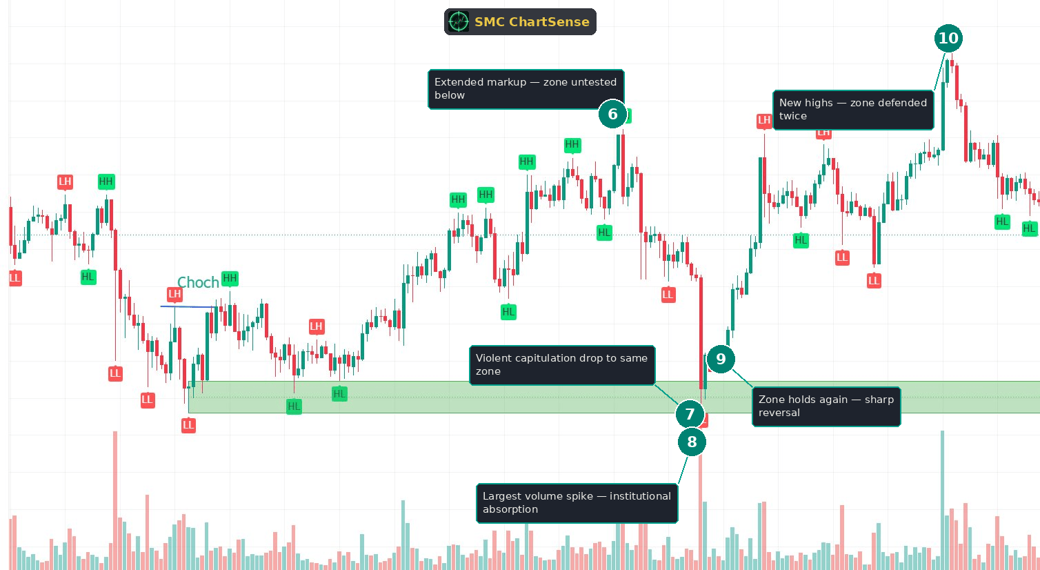
6. Extended markup — zone untested below
The markup continues to a major HH near the top of the chart. This is the high point of the cycle’s first leg. By now, price is far above the demand zone, and the zone has been untested for a long stretch — dozens of bars of price action have elapsed since the origin.
This distance is what makes the next move so psychologically difficult to read correctly. When price is making new highs, the origin zone feels irrelevant — ancient history, far below, forgotten. Traders stop watching it. But the zone hasn’t lost its significance; it’s just been dormant. The institutional buyers who defended it at the origin haven’t gone anywhere. The zone is waiting, and the violent move that’s about to test it will catch most traders by surprise precisely because they’ve stopped paying attention to a level that was the foundation of the entire rally.
7. Violent capitulation drop to the same zone
Price collapses. From the highs, a sharp, fast markdown drives price all the way back down to the demand zone in a near-vertical drop. This isn’t a gentle pullback — it’s a capitulation flush, the kind of move that triggers stop-losses cascade-style and convinces most traders that the trend is over.
The structural read is that price is returning to test the origin zone for the second time. But the character of this test is the opposite of the first. The first test was a quiet accumulation low at the end of a grinding markdown. This second test is a violent, fast, panic-driven collapse. Same zone, opposite character — and that’s exactly why most traders misread it. They see the violence of the drop and conclude the zone will break, when the violence is actually the setup for the strongest possible hold.
The reason a violent capitulation into a validated zone is often the best buy is mechanical: the speed and panic of the drop flush out every weak long and trigger every stop, transferring inventory to the institutions waiting at the zone at the best possible prices. The more violent the flush, the more complete the transfer. The next phase — the volume on this drop — is what confirms whether the institutions showed up.
8. Largest volume spike — institutional absorption
This is the single most important candle on the chart, and the volume panel is what reveals it. The capitulation low into the demand zone prints the largest volume bar on the entire chart — bigger than anything in the markup, bigger than the origin spike. That volume is the signature of massive institutional absorption: the panic selling of trapped longs being swallowed whole by institutional buyers defending the zone.
This is the same volume logic from the origin (phase 3), but amplified. At the origin, a heavy-volume hold established the zone. Here, a record-volume hold confirms the zone is still being defended — and defended more aggressively than ever. The volume isn’t just high; it’s the highest on the chart, which tells you the institutional commitment to this level has, if anything, increased since the origin.
The diagnostic is the relationship between the volume and the reversal. A record-volume bar that breaks the zone and keeps falling would be distribution — institutions selling into the panic. A record-volume bar that holds the zone and reverses is absorption — institutions buying the panic. The reversal in the next phase is what confirms which one this is. The volume tells you a large transfer occurred; the price action tells you which side won.
9. Zone holds again — sharp reversal
The zone holds. The candle that prints the record-volume low closes well off its lows — a long lower wick rejecting the capitulation — and the candles that follow reverse sharply upward. The zone has defended price for the second time, and the speed of the reversal confirms that the record volume was absorption, not distribution.
This second hold is what completes the teaching of the chart. A demand zone that holds once on heavy volume with a CHoCH is a good zone. A demand zone that also holds a violent capitulation retest on record volume is a great zone — one whose credibility has now been demonstrated twice, under opposite conditions. The first hold was quiet accumulation; the second was violent capitulation absorption. Both held. That’s a level institutions are clearly committed to defending.
For a trader who recognized the zone as validated from phase 4, this second test was the highest-probability entry on the chart. The setup was unambiguous: price returning to a CHoCH-confirmed origin zone, on the largest volume bar of the chart, with an immediate reversal off the lows. The entry is at the reversal, with a stop just below the zone — and the reward is the second leg of the cycle. The violence of the drop, which scared everyone else out, was precisely what made the entry so clean for anyone who trusted the zone.
10. New highs — zone defended twice
From the second hold, price launches the cycle’s second leg and drives to new highs on the right side of the chart. The demand zone has now been defended twice and has fueled two separate legs higher. The role it played at the origin — structural floor of the bullish cycle — held all the way through.
This new high confirms the entire read. The zone wasn’t a one-time bounce; it was a durable institutional level that defended price across the full cycle. The two tests — quiet accumulation at the origin, violent capitulation on the retest — bookend the cycle, and both produced the same outcome because the same institutional buyers were behind the zone on both occasions.
The completed pattern is the full life of a trusted demand zone: a markdown into an origin low, a heavy-volume accumulation hold, a CHoCH that confirms the character shift, a markup leg, a long dormant stretch, a violent capitulation retest on record volume, a second hold, and a continuation to new highs. Each stage was independently readable, and the volume was the connective thread that confirmed the zone was live at both tests.
What this scenario teaches that most SMC content misses
Three observations from this chart that get less attention than they deserve in standard SMC education:
A demand zone’s credibility compounds with each defended test. Most SMC content treats a zone as either valid or invalid based on a single encounter. The reality is that zones earn trust progressively. The first hold establishes a zone as a candidate. A CHoCH off that hold confirms it produced a real character shift. A second hold — especially under opposite conditions — proves the institutional commitment is durable. By the time a zone has held twice, once quietly and once violently, it’s a far higher-conviction level than a zone that’s only been tested once. Reading zones as accumulating credibility rather than as binary valid/invalid is what lets a trader size up confidently on a second test that looks frightening.
The two tests of a strong zone often look completely different — and the violent one is usually the better entry. The first test of this zone was a quiet accumulation low at the end of a grind. The second was a violent capitulation flush on record volume. Most traders would buy the quiet one (it feels safe) and avoid the violent one (it feels like the zone is breaking). That instinct is backwards. The violent capitulation into a validated zone is usually the better entry, because the speed and panic of the drop flush out weak hands and transfer inventory to institutions at the best prices. The more violent the flush that holds, the stronger the signal. Learning to buy the terrifying retest of a trusted zone — rather than the comfortable one — is one of the highest-value skills in this style of trading.
Record volume into a level is meaningless until you know whether the level held. A massive volume spike is not automatically bullish or bearish — it signifies a large transfer of inventory, nothing more. The direction of that transfer is revealed by what price does next. Record volume that breaks the zone and continues is distribution: institutions selling into the panic. Record volume that holds the zone and reverses is absorption: institutions buying the panic. The volume bar looks identical in both cases. The diagnostic is the reversal. This is why volume must always be read together with the price reaction at the level — the volume quantifies the transfer, and the price tells you who won. A trader watching volume alone learns nothing; a trader watching volume and the hold knows immediately whether institutions defended the zone.
The reader’s takeaway
The mental model: demand zones are not validated once and then trusted forever, nor are they invalidated by a single scary test. They earn credibility progressively, and the strongest zones are the ones that have defended price more than once under different conditions. The origin zone of a bullish cycle — the low where the move began, confirmed by a CHoCH on heavy volume — is the single most important level on the chart for the duration of that cycle.
The sequence for trusting a zone on its second test has three parts. First, the zone must have been validated at the origin — a hold on heavy volume, followed by a CHoCH that confirms a real character shift. Second, the return to the zone must hold — and the volume on that hold is the diagnostic. Third, the reversal off the zone confirms that the volume was absorption, not distribution. When all three are present, the second test is a high-conviction entry, even when the move into the zone is violent.
The volume reading is the spine of the entire analysis. At the origin, a heavy-volume hold establishes the zone. On the retest, a record-volume hold confirms the institutional commitment has only grown. In both cases, the volume quantifies the transfer of inventory, and the immediate reversal confirms that institutions were the buyers. Heavy volume into a zone that holds is the clearest footprint of absorption on the chart — and it means the same thing whether it happens at the origin or on a deep retest dozens of bars later.
In this chart, every part of the sequence was present. The origin zone formed on a heavy accumulation spike and was confirmed by a CHoCH. The markup leg validated it. The violent capitulation retest on record volume tested it under the harshest conditions, and it held. The continuation to new highs confirmed the zone’s durability. A trader who tracked the zone from the origin and trusted it on the violent retest was positioned for the cleanest entry of the entire cycle.
The trap to avoid is abandoning a validated zone because its second test looks violent. The capitulation drop in this chart would have scared most traders into believing the zone was breaking. But the zone had already proven itself at the origin, and the record volume on the retest was the signature of institutions defending it harder than ever. Reading the violence as confirmation rather than threat — and trusting the volume signature of absorption — is what separates a trader who buys the best entry of the cycle from one who watches it from the sidelines, convinced the trend is over.
The skill being trained here is reading zones as durable institutional levels with compounding credibility, and using volume as the diagnostic for whether a level is being defended. A demand zone isn’t a line that works once. It’s a record of where institutions are committed to buying — and the more times it holds, especially under opposite conditions, the more it can be trusted.
Read enough twice-tested zones at this depth, and the pattern becomes obvious in real time. The signs are always the same: an origin low that holds on heavy volume, a CHoCH confirming the character shift, a markup leg, a return to the zone, and a volume signature on that return that confirms absorption rather than distribution. Each component is independently readable. The trade is what the components point toward, taken together as the life cycle of a level that earned its trust.
Would a setup like this have held up across years of data?
Reading one chart is insight. Knowing whether a pattern has a statistical edge across hundreds of historical instances is something else. SMC ChartSense lets you configure SMC strategy parameters — order blocks, FVG, market structure, risk-reward — and backtest them against years of Binance perpetuals data. No coding required.
Try the SMC Backtester →Educational research tool. Not investment advice. Past performance does not guarantee future results.
DISCLAIMER: This article is for educational purposes only. It explains concepts from technical analysis literature and reads a historical chart for teaching purposes. It does not constitute financial advice, trading advice, or investment recommendations. SMC ChartSense is strictly an educational simulator designed for pattern recognition practice. We do not provide brokerage services, market recommendations, or execution platforms. We are not registered as a Research Analyst.