
When the Floor Doesn’t Form: Reading a Markdown That Ends in Chop
A tape read of the case the textbooks skip. An order block rejects price at the top and the markdown plays out cleanly — but at the bottom, no tidy demand zone forms. Instead price churns in overlapping, structureless chop. The teaching most SMC content avoids: not every markdown ends in a buyable zone, and recognizing when there’s no clean setup is itself a high-value read. Sometimes the best trade is the one you don’t take.
SMC ChartSense Team · 14 min read
What this article reads: A markdown that doesn’t resolve cleanly. A bearish order block at the highs rejects price on its retest, and the markdown traverses down to a capitulation low — all textbook. But where a clean demand zone would normally form, price instead enters a choppy, overlapping base: alternating HHs, HLs, LHs, and LLs with no decisive zone and no clear bias. The focus of this read is the base, not the rejection: how to recognize when structure has broken down into noise, why forcing a demand-zone read onto chop is a common and costly trap, and why the correct read is often to stand aside and wait rather than manufacture a setup that isn’t there.
Phases 1–5 — The clean part: rejection and markdown

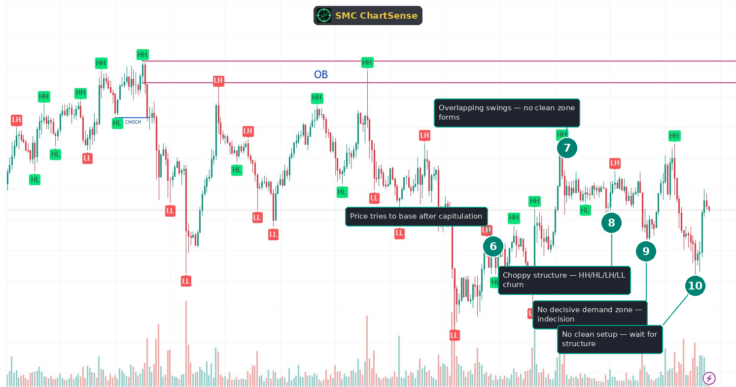
1. OB ceiling forms at the highs
A bearish order block forms at the early highs — the supply band marked across the upper portion of the chart. Price tops out here, distributes, and the zone becomes the supply ceiling for what follows. This is the same opening setup covered in depth across our order block reads, so we’ll move through it quickly and spend the article’s attention where the real lesson is — the base that fails to form at the bottom.
The ceiling is legitimate: price departs from it decisively, confirming institutional supply. It sits above as the reference level for the downside, exactly as a supply ceiling should.
2. Retest of OB — rejection setup
Price recovers and travels back up to the OB band. An HH taps the underside of the zone — the retest. The approach lacks strong conviction, and the dormant supply is still live, so this sets up a rejection. This is the standard dormant-OB retest mechanic; for the full bar-by-bar treatment of how this kind of rejection works, the dormant order block read linked in our guide covers it in detail.
The point worth noting is that this top-side setup is the clean, readable part of the chart. A trader could short this rejection with a clear thesis and a defined stop above the OB. The contrast with the bottom of the chart — where no such clean setup ever appears — is the entire lesson.
3. Rejected — markdown begins
The OB rejects price. The candles stall at the ceiling and roll over into the markdown. The short thesis from the retest is now working. So far, everything about this chart is textbook — a clean ceiling, a clean rejection, a clean start to the move down.
This is important to establish, because it sets the expectation that the chart will resolve cleanly at the bottom too. A clean rejection and markdown feels like it should hand off to a clean demand zone at the lows — that’s the pattern in most polished examples. The value of this chart is that it breaks that expectation.
4. Deep markdown — LH/LL down
The markdown traverses the range. Price prints lower highs and lower lows, stair-stepping down with conviction. The bias is firmly down, every bounce is capped by a lower high, and the structure is clean and readable throughout the descent. A trader holding the short from the rejection rides this leg with the trend clearly in their favor.
Through the entire markdown, the structure cooperates. The lower highs say “still going down,” the lower lows confirm it, and there’s no ambiguity about direction. This clean traverse is what makes the breakdown at the bottom so jarring by comparison.
5. Capitulation LL — volume spike
The markdown bottoms at a capitulation low on a volume spike — one of the larger bars on the chart. In a clean scenario, this is exactly where a demand zone would form: heavy volume into a low, absorption, and the start of a base that becomes buyable.
This is the moment the chart sets up its real lesson. The capitulation volume looks like the signature that should precede a clean demand zone. A trader conditioned on textbook examples will expect a tidy base to form here and a recovery to follow. The phases that come next show what happens when that expectation isn’t met — when the capitulation doesn’t resolve into clean structure, but into chop.
Phases 6–10 — The messy part: when no floor forms
6. Price tries to base after capitulation
After the capitulation low, price attempts to base. There’s an initial bounce and some sideways action — the beginning of what could become a demand zone. At this early stage, it’s reasonable to watch for a base forming, exactly as you would after any capitulation. The question is whether the base develops into clean, decisive structure or degrades into chop.
This is the honest decision point. A trader can’t know yet which way the base will resolve. The discipline is to watch how the structure develops rather than to assume a clean zone is forming just because capitulation volume printed. The next several phases reveal that this base never earns the clarity a tradeable demand zone requires.
7. Overlapping swings — no clean zone forms
Instead of building a tidy base, price produces overlapping swings. Highs and lows print at similar levels, candles overlap heavily, and no clear accumulation range establishes itself. A clean demand zone has definition — a clear low, a clear reaction, a readable boundary. This base has none of that. It’s a smear of overlapping price action with no decisive level to anchor to.
This is the first concrete sign that the chart is not going to hand off cleanly. The overlapping swings are the visual signature of indecision — neither buyers nor sellers establishing control, price churning without building the kind of structure a trader can trade against. The absence of a clean boundary is itself the information.
8. Choppy structure — HH/HL/LH/LL churn
The structure labels tell the story: HH, HL, LH, and LL all appear in close succession, with no consistent sequence. In a clean trend, the labels form a pattern — HH/HL for an uptrend, LH/LL for a downtrend. Here they alternate without order. When the structure labels stop forming a consistent sequence and start alternating randomly, that’s the definition of chop — the market has no directional bias to read.
This is the diagnostic for a structureless base. A trader looking for a clean signal will be tempted to pick one of these swings and treat it as the start of a trend — to see the HH and call a reversal, or the LL and call continuation. But in a churn like this, any single swing is noise, not signal. The alternating labels are telling you there is no trend to trade, in either direction.
9. No decisive demand zone — indecision
By this point it’s clear: no decisive demand zone has formed. The base that started after the capitulation never developed into a clean, buyable level. Price is simply oscillating in a band of indecision, with no zone that holds with conviction and no structure that commits to a direction.
This is the read most SMC content never shows, because it’s not a clean setup — it’s the absence of one. But recognizing the absence is exactly the skill being trained here. The chart is not offering a trade. A trader who insists on finding a setup in this chop will manufacture one — drawing a demand zone where there isn’t a clean one, taking a long on a random HH — and that manufactured trade is exactly the kind that bleeds an account.
10. No clean setup — wait for structure
The correct read is to stand aside. There is no clean setup here, and the highest-value decision is to recognize that and wait. The chop will eventually resolve — into a clean demand zone, a continuation, or a breakout with real structure — and that is when a trade becomes available. Until the market commits to readable structure, the disciplined action is no action.
This is the hardest skill in trading to internalize, because it produces nothing visible — no entry, no position, no story. But avoiding a low-quality trade preserves capital and attention for the high-quality setups that the clean charts offer. The skill of recognizing chop and waiting is what separates a trader who takes ten good setups a month from one who takes ten good setups plus thirty bad ones that erase the gains.
The chart will resolve eventually. When it does — when structure returns and a clean zone or a decisive break forms — the patient trader is positioned to read it, with capital intact and judgment unclouded by a losing position taken in the chop.
What this scenario teaches that most SMC content misses
Three observations from this chart that get less attention than they deserve in standard SMC education:
Not every markdown ends in a buyable zone. Polished SMC content almost always shows the clean case: capitulation, a tidy demand zone, a clean reversal. Real charts frequently don’t cooperate. A markdown can bottom into a structureless churn that never forms a decisive zone. A trader who has only studied clean examples will force the clean template onto the chop — drawing a demand zone that isn’t really there — and take a low-quality trade. Studying the messy case is what inoculates against that. Sometimes the capitulation is real but the base that follows is noise, and recognizing the difference is the read.
Alternating structure labels are the signature of chop. In a clean trend, structure labels form a consistent sequence — HH/HL climbing, or LH/LL falling. The moment those labels start alternating without order — an HH, then an LH, then an HL, then an LL, all at similar levels — the market is telling you it has no bias. This is a concrete, visual diagnostic for chop that doesn’t require judgment calls: when the sequence breaks down, the trend has broken down, and any single swing is noise rather than signal. Reading the pattern of the labels, not any individual label, is what reveals the indecision.
Recognizing the absence of a setup is itself a high-value read. The most valuable output of analyzing this chart is the decision not to trade it. That feels like nothing — no entry, no position — but it’s a skill that’s harder and more profitable than finding setups. The trader who can look at a structureless base and conclude “there’s no clean trade here, wait” preserves the capital and discipline that the clean setups require. Forcing a trade into chop is one of the most common ways traders give back the gains from their good setups. The discipline of standing aside until structure returns is not passivity — it’s active risk management, and it’s the difference between a trader who compounds and one who churns.
The reader’s takeaway
The mental model: a clean rejection and markdown does not guarantee a clean demand zone at the bottom. The top of this chart was textbook — a supply ceiling, a rejection, a clean markdown. The bottom was the opposite — a structureless churn with no decisive zone. Reading the difference between a base that’s building tradeable structure and one that’s just chopping is the skill this chart trains.
The diagnostic for chop has two parts. First, the structure: in a clean base or trend, the swing labels form a consistent sequence; in chop, they alternate without order, with highs and lows printing at similar levels and candles overlapping heavily. Second, the boundary: a clean zone has definition — a clear level that holds with conviction — while a churn has no readable boundary to anchor to. When both signs are present — alternating labels and no clean boundary — there is no tradeable setup, only indecision.
The correct response to chop is to wait. The chart will eventually resolve into readable structure — a clean zone, a continuation, or a decisive break — and that is when a trade becomes available. Until then, the disciplined action is no action. This is the hardest skill to practice because it produces nothing visible, but avoiding the low-quality trade is what preserves the capital and focus that the high-quality setups require.
In this chart, the sequence was clear once read honestly. The OB rejected price at the top, the markdown traversed cleanly to a capitulation low, and then — where a clean demand zone should have formed — price churned in structureless chop. A trader who recognized the chop for what it was stood aside and waited; a trader who forced the textbook template onto the noise manufactured a trade that the chart never actually offered.
The trap to avoid is the manufactured setup. After a clean markdown and a capitulation low, the pull to find a long is strong — the pattern feels like it should resolve into a demand zone. But feeling and structure are different things. When the structure says chop, the absence of a clean zone is the read, and respecting it is what keeps a trader out of the trades that erase the gains from the clean ones.
The skill being trained here is discrimination — telling a real setup from a forced one, and being willing to conclude that the right number of trades on a given chart is sometimes zero. The clean charts in our other reads show what a tradeable setup looks like. This one shows what it looks like when there isn’t one, and why recognizing that is just as important.
Read enough structureless bases at this depth, and the signs become obvious in real time: a capitulation that doesn’t resolve into a clean zone, overlapping swings, alternating structure labels, no decisive boundary. Each is a signal that the market is in indecision rather than offering a trade. The skill is to name the chop, respect it, and wait for the structure that will eventually return — with capital and judgment intact for the setup that’s actually worth taking.
Would a setup like this have held up across years of data?
Reading one chart is insight. Knowing whether a pattern has a statistical edge across hundreds of historical instances is something else. SMC ChartSense lets you configure SMC strategy parameters — order blocks, FVG, market structure, risk-reward — and backtest them against years of Binance perpetuals data. No coding required.
Try the SMC Backtester →Educational research tool. Not investment advice. Past performance does not guarantee future results.
DISCLAIMER: This article is for educational purposes only. It explains concepts from technical analysis literature and reads a historical chart for teaching purposes. It does not constitute financial advice, trading advice, or investment recommendations. SMC ChartSense is strictly an educational simulator designed for pattern recognition practice. We do not provide brokerage services, market recommendations, or execution platforms. We are not registered as a Research Analyst.