
From CHoCH to Cycle Peak: Reading a Complete Bullish Recovery
A complete tape read of one chart that captures everything between the bottom and the eventual top — the descent that built the conditions, the CHoCH that signaled the shift, the OB retest that confirmed institutional commitment, the multi-leg markup phase, and the climax volume signature at the cycle peak. Most SMC content focuses on bottoms and tops. This article focuses on the long phase between them — where most actual money is made and lost.
SMC ChartSense Team · 15 min read
What this article reads: A bullish recovery cycle from the bottom of a prior decline through the establishment of an uptrend, multiple stair-step legs higher, and the climax volume event that ends the cycle. Two specific entry signals are covered — the CHoCH break itself, and the OB retest several weeks later that gave a second-chance entry at deeper prices. The volume profile across the entire markup tells its own story alongside the structure.
Phases 1–5 — From descent to the markup origin

1. Distribution descent — the LL stair
The chart opens with a HH already in place at the top-left, but the candles immediately following tell the real story: a sustained sequence of lower lows printed in stair-step fashion. Each LL is followed by a small bounce, then a deeper LL. The descent is multi-week, not panic-driven.
This is the same distribution pattern Article 3 explored from the bearish side. The grinding descent rather than capitulation flush. Each new low absorbs available bids without producing real reaction. Volume across this phase is moderate — visible red bars but nothing that stands out as institutional capitulation. The market is delivering supply patiently, and the buyers who step in at each new low are getting overrun.
Reading this descent correctly requires holding back the urge to call a bottom. Multiple LLs in sequence does not mean “the next LL will be the bottom.” Distribution can extend much further than retail traders expect. The bottom isn’t called by counting LLs — it’s called by structural shift, which is what the next phase delivers.
2. First reaction — LH forms
After the lowest LL prints, price produces its first meaningful bounce in the descent. The bounce climbs and prints an LH — a lower high relative to recent structure, but importantly, a swing high that the market actually pauses at rather than blowing through immediately.
An LH after multiple LLs is not yet a bullish signal. By itself it just means the market took a breath. What matters is what happens next. If the next move down breaks below the prior LL, the descent continues and this LH was just a routine pullback. If the next move up breaks above this LH, something is changing.
The volume on this LH formation is informative if you know what to look for. Look at the volume bars during this small bounce in the chart’s lower panel. The buyer-side bars are noticeably larger here than during any previous bounce in the descent. That asymmetry is the first hint that real buying may be entering the market — not enough to confirm anything yet, but enough to put the trader on notice.
3. CHoCH — character flips bullish
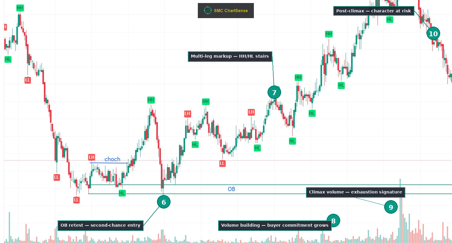
Here is the moment everything changes. Price climbs back from the LH consolidation and closes above the prior LH level. The blue line on the chart marks this CHoCH — the Change of Character. (CHoCH = Change of Character: a candle close that breaks the most recent significant swing high in a downtrend, or swing low in an uptrend, signaling a possible character shift.)
The distinction between this CHoCH and a normal pullback is crucial. A pullback within a downtrend produces small green candles that fail before reaching the prior LH. A CHoCH produces a candle that closes above the LH with conviction. That single body close is the structural event. Wicks above the LH that close below it are not CHoCHs — they’re failed tests, often part of continued distribution.
The volume on the CHoCH candle and the few candles that follow is a key tell. In this chart, the candles producing the CHoCH carry visibly larger green volume bars than any bullish move during the prior descent. That volume signature is the institutional buying confirmation. The same buyers who were absent throughout the descent are now committing capital to drive structure higher.
Reading both the structure (the CHoCH break) and the volume (the buying confirmation) together is what separates this from a false signal. CHoCHs without volume confirmation often fail. CHoCHs with strong volume confirmation rarely do.
4. OB at demand — formed at the original LL
Look at the horizontal teal lines drawn near the bottom of the chart. They mark the OB zone — the price range where the last bearish candles printed before the impulsive move that produced the CHoCH. (In this bullish context, OB = the last bearish candle cluster before the impulsive bullish move that broke structure. It’s the presumed origin of institutional buying.)
The most important detail about this OB: it was formed at the lowest LL, before the CHoCH happened. The institutional buyer who absorbed supply at this zone was bidding into the descent, not after it. Their entry was already complete by the time the CHoCH structurally confirmed what they had set in motion.
This timing matters because it changes how you should think about the OB in real time. When you see an OB form at a major low, the institutional trade has already happened. The CHoCH is the public announcement, but the entry was earlier. If you’re reading the chart in real time and you wait for the CHoCH to enter, you’re entering after the institution did. That’s still a valid trade — but recognizing the time sequence helps you understand who’s already positioned and why the level has structural meaning.
5. First HH — markup leg begins
From the CHoCH, price drives upward in a clear bullish impulse, printing the first HH of the new structure. The candles producing this rally are visibly larger than the pullback candles around them. Volume is meaningful. The structure flips from “possible CHoCH” to “confirmed bullish character” with this first HH print.
This HH establishes the new higher reference. Future pullbacks should produce HLs above prior LLs. Future rallies should produce HHs above this first HH. The chart has now committed to bullish structure — at least until something breaks the new pattern.
What follows next is unexpected for traders who don’t know to expect it. After this initial HH, price doesn’t continue smoothly upward. It drops sharply — almost back to the OB zone. To a beginner reader, this drop looks like the bullish move failed. It didn’t. The drop is what the next phase explains.
Phases 6–10 — The retest, the markup, and the cycle peak
6. OB retest — the second-chance entry
Price drops sharply from the first HH and pierces back down to the OB zone. The candles forming this retest are large red bars — to a beginner reader, this looks like the bullish thesis is failing. It isn’t. The retest is the institutional mechanic that gives a cleaner entry to traders who missed the original CHoCH.
Three observations about this retest matter:
The retest pierces below the lower OB boundary with a wick. Look carefully at where the candle bodies close versus where the wicks reach. The wick goes below the lower OB line, but the candle bodies close back inside the zone. This is the same wick-versus-close distinction that defined valid setups in earlier articles. A wick below the zone with body close back inside is rejection at the level. A body close below the zone is invalidation.
The volume on the retest is moderate, not capitulation-sized. Compare the retest’s volume bars to the ones during the original descent in Phase 1. They’re not larger. That tells you the retest is not new selling pressure — it’s existing late-entry buyers getting shaken out, not institutional supply re-emerging.
The reaction off the retest is sharp and immediate. Within a few candles of touching the OB, price drives back up with conviction. The candles after the retest are large green bars, often larger than the retest’s red candles. This asymmetry — small selling pressure absorbed quickly by larger buying — is the signature of institutional defense at the demand level.
The retest provides the second-chance entry. Traders who missed the CHoCH break get a cleaner price level here, with the additional confirmation that the OB zone has now been tested and held. From this point forward, every structural reference points up.
7. Multi-leg markup — HH/HL stairs
From the OB retest, price climbs in a clean stair-step pattern across the entire middle and right portion of the chart. HH. Pullback to HL. HH again. Pullback to HL. Another HH. The pattern repeats with consistency that’s visually obvious on the chart.
This is the textbook markup phase that every SMC textbook describes — and the phase that almost no textbook actually shows in extended form. Most concept-driven articles show one or two HHs and call it complete. Real markup phases extend across many candles, with the pattern repeating until the structure breaks. This chart shows the full version.
The character of the markup matters. Notice that each pullback to HL is shallower as the trend matures. The first pullback after Phase 6 goes deep — almost to the prior HL. Later pullbacks barely retrace before the next HH prints. This tightening of pullback depth is itself a signal — it suggests buying pressure is increasing relative to selling pressure, which is consistent with a maturing trend.
It’s also a warning. Trends that become too smooth, too unidirectional, with shrinking pullbacks, are often approaching exhaustion. Healthy trends have meaningful pullbacks because two-sided participation is what provides liquidity for continued moves. When the pullbacks dry up, the next major event is often a sharp reversal, not continued markup.
8. Volume building — buyer commitment grows
Look at the volume panel across the middle of the chart, during the multi-leg markup. The volume bars on the up legs are visibly larger than the bars on the pullbacks — the asymmetry that defined healthy bullish structure in Phase 5 is intact. But there’s a second pattern emerging: the absolute size of the up-leg volume bars is growing as the trend progresses.
Each new HH printed in the markup tends to come with slightly more volume than the previous HH. Compare the volume on Phase 5’s first HH to volume on the HHs in Phase 7. The later ones are larger. This is the signature of accelerating commitment — buyers are not just maintaining the trend, they’re committing more capital to push it further.
Accelerating volume during markup is a double-edged signal. On one hand, it confirms the trend is real and likely to continue near-term. On the other hand, it sets up the next phase of the cycle. Markets cannot accelerate volume indefinitely. At some point the accelerating commitment becomes the climax — the moment when the most aggressive buying happens before the trend ends.
The trader watching volume in real time tracks two things during markup: (1) is volume confirming each new HH? and (2) is the volume profile accelerating in a way that suggests climax is approaching? If both answers are yes, the trade is working but you should be alert for exhaustion signals.
9. Climax volume — the exhaustion signature
Toward the right side of the chart, the volume panel produces the largest single green bar visible across the entire chart. It dwarfs every other volume bar in the markup. This bar appears at one of the late HH prints, near the cycle peak.
This is the climax volume signature. It’s the most reliable single signal that a sustained trend is exhausting itself. The mechanic behind it is straightforward: at major cycle peaks, FOMO buying from late retail traders combines with institutional position-closing. Both groups transact aggressively at the same time. The combined volume produces a single bar that visibly stands out from recent context.
What makes this signature reliable rather than coincidental is the combination of three elements:
The volume bar is the largest in recent context. Not just elevated — visibly the largest visible since the start of the markup phase.
It happens at or near a structural high. Climax volume in the middle of a trend is usually just heavy buying. Climax volume at the cycle peak is exhaustion.
The candle that produces it often has a long upper wick or unusual body shape. The candle reaches up but the body closes well off the high — evidence that aggressive buying met aggressive selling at the top, with sellers winning the close.
When all three appear together, the probability that the cycle is ending materially exceeds the probability that the trend continues at the same pace. The trader watching this in real time recognizes the exhaustion signature before structure has confirmed the reversal. The trader who only reads structure waits for the first LH, by which point much of the move has already happened.
10. Post-climax — character at risk
After the climax volume bar, the chart begins producing new structure that’s qualitatively different from the markup. The candles after the climax show: a sharp pullback that’s deeper than recent pullbacks, then an attempt to recover that fails to reach the prior HH, then continued downward pressure.
This is the early warning that bullish character is at risk of flipping. Specifically:
If the recovery attempt after the climax pullback prints a new HH above the climax bar’s high, the trend continues. The climax was just heavy buying, not exhaustion. This sometimes happens.
If the recovery attempt fails to make a new HH and instead prints a lower high, that’s a structural warning sign. The first LH after a climax is the structural confirmation of what the volume already suggested. The character is shifting.
If the next move down breaks below the prior HL, the trend has structurally broken. This is the bearish CHoCH that mirrors the bullish CHoCH at the start of the chart. The cycle is complete.
The chart we’re reading shows the early portion of this post-climax behavior. The candles at the right edge are producing the kind of structure that’s consistent with the start of distribution — not yet confirmed, but consistent with what climax volume implies. Whether the chart goes on to confirm a new bearish phase or recovers and continues higher is beyond what’s visible. What matters for the read is recognizing the warning signature, which experienced traders use to reduce exposure or close longs before structure confirms reversal.
What this scenario teaches that most SMC content misses
Three observations from this chart that don’t get enough attention in standard SMC educational material:
The OB forms before the CHoCH, not after. Most retail SMC content presents these concepts in the wrong sequence — first the CHoCH, then “find the OB that produced it.” This framing implies the institutional entry happened at the CHoCH. It didn’t. The institutional entry was at the OB during the descent. The CHoCH is the public structural confirmation of what already happened privately. Understanding this time sequence changes how you think about reading charts in real time.
The retest of the OB is often a better entry than the CHoCH itself. The CHoCH gives the first signal. The OB retest, when it happens, gives the second-chance entry at deeper prices with additional confirmation that the level has been tested and held. Many institutional setups specifically target the retest entry rather than the breakout entry, because the retest provides a tighter risk profile. If you missed the CHoCH, you didn’t miss the trade — the retest often gives a better one.
Climax volume is the most reliable end-of-cycle signal in SMC, and almost no SMC content covers it. Most SMC educational material focuses on entries (where to get in) and rarely covers exits (when to get out). The climax volume signature — largest volume bar in recent context, at or near a structural high, with candle body closing off the high — is the cleanest single signal that a sustained trend is ending. Trading this signal alone, with no other technical input, would catch the majority of major reversal points across most markets and timeframes. It’s worth more than any other single concept in the framework, and it’s barely taught.
The reader’s takeaway
The chart we just read together is structured around three distinct moments that experienced traders recognize and beginners miss:
The CHoCH at Phase 3 is the moment the bullish thesis becomes valid. Before this, you should not be looking for long setups. After this, you should.
The OB retest at Phase 6 is the moment the bullish thesis becomes confirmed. Before this, the CHoCH could still fail. After it, the institutional commitment has been tested and held.
The climax volume at Phase 9 is the moment the bullish thesis becomes vulnerable. Before this, every pullback can be assumed to be a buying opportunity. After this, every rally should be assumed to be a chance to reduce exposure.
Reading these three moments correctly turns the entire markup phase from a confusing sequence of HHs and HLs into a structured framework with clear entries, confirmation points, and exits. Most retail traders never internalize this framework. They enter randomly during the markup based on whatever recent candle pattern caught their attention, hold through obvious exhaustion signals because they’re hopeful, and exit only after structure has clearly broken — by which point most of their gains have evaporated.
The framework above is what changes that pattern. CHoCH for the entry signal. OB retest for the confirmed entry or position add. Climax volume for the exit signal. Three reference points across an entire cycle. Each one gives information the others don’t.
One chart at this depth is one read. The library compounds with every new scenario you trace. The integration of structure plus volume plus institutional logic stops being abstract concepts and starts being mechanical patterns that you can see clearly while they’re still unfolding — at which point trading the framework becomes systematic rather than guesswork.
This is what tape reading actually teaches. Not entries on individual setups, but the full cycle from possibility through confirmation through exhaustion. Read enough cycles at this depth, and the next live chart you watch starts to read itself.
DISCLAIMER: This article is for educational purposes only. It explains concepts from technical analysis literature and reads a historical chart for teaching purposes. It does not constitute financial advice, trading advice, or investment recommendations. SMC ChartSense is strictly an educational simulator designed for pattern recognition practice. We do not provide brokerage services, market recommendations, or execution platforms. We are not registered as a Research Analyst.